ui_playground: a component library for Flutter, generated
 Koen Van Looveren
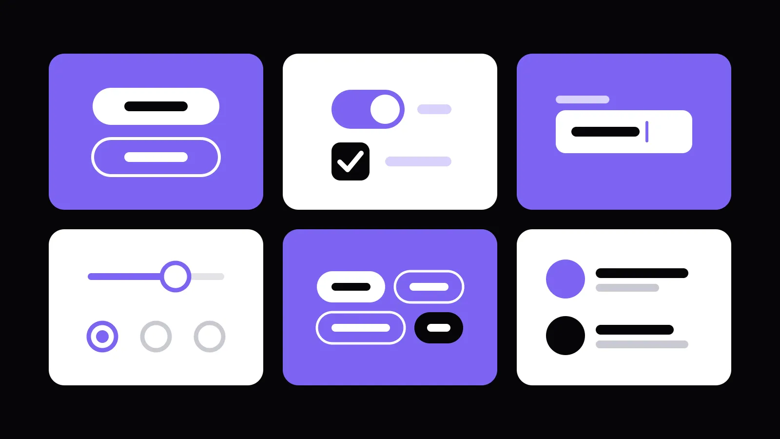
Every app we build has its own component library: buttons, inputs, cards, all in the client's branding. To build and check those components on their own, outside the app, you need a playground. Widgetbook does that, but it takes a lot of boilerplate, the generators around it never felt right, and it looks like Widgetbook, not like the app it shows. So Koen built ui_playground, and showed it in a lightning talk at Flutter Belgium Meetup #26 at A.C.A. Group in Ghent. The video is at the bottom.
Why our own playground
- In the style of the app. Designers and product owners use the playground too. When it looks like the app, with the same theme and the same localization, they feel at home right away.
- A cleaner interface. Just the components, their variants and the inputs to play with.
- No boilerplate. Writing the playground code by hand is the part developers skip. When it costs one line, they do it.
Built with an agent, finished by hand
The first version was a test of agentic coding: Koen gave the challenge to Claude Code, and in an hour and a half the agent had built the basic framework. Then came about five more hours of work by hand, to get it the way he wanted. It has been in use in four projects since.
Three packages
The setup follows the pattern of every build_runner generator, so it feels familiar:
ui_playground: the playground itself, a Flutter app with sections and components;ui_playground_annotations: the annotations;ui_playground_generator: the generator forbuild_runner, which writes all the boilerplate.
The playground is organised in sections (buttons, inputs, your branding, your text styles), and every component has one or more variants, a primary and a secondary button for example. Every variant has its inputs: the properties you can change while you look at the result. Written by hand, that is a class for the item, a class per variant and a class for the inputs, for every component.
One annotation
With the generator, a component needs one line:
@UiPlaygroundComponent(title: 'My Button')
class MyButton extends StatelessWidget {
  const MyButton({required this.title, this.isEnabled = true, this.onTap, super.key});

  final String title;
  final bool isEnabled;
  final VoidCallback? onTap;

  @override
  Widget build(BuildContext context) { ... }
}
The generator reads the constructor and makes an input for every parameter: a text field for the title, a switch for isEnabled. A callback like onTap doesn't get an input; when it is called, the playground shows a notification with the values of its parameters, so you see straight away whether it was called and with what.
One file tells the generator where to write:
// lib/ui_playground_items.dart
@UiPlaygroundComponents()
library;

import 'package:ui_playground/ui_playground.dart';
Run dart run build_runner build and everything ends up in one generated file, with comments, so it stays readable. Add the generated items to the sections of your playground:
import 'ui_playground_items.ui_playground.dart';

UiPlaygroundApp(
  title: 'My App Playground',
  sections: [
    UiPlaygroundSection(
      title: 'Buttons',
      items: [
        MyButtonPlaygroundItem(), // generated
      ],
    ),
  ],
)
What it supports
String,bool,intanddouble;- enums, as a list of all their values;
Color,DateTimeandIconData;- nullable and non-nullable parameters, with their default values;
- your own classes, with an input you write yourself and register in the config, after which the generator picks them up automatically.
Next up: default values that only apply in the playground. An icon with a required size gets size 0 in the playground now, and then you see nothing; an extra annotation will set it to 24 there, without changing your component.
Watch the lightning talk
ui_playground, a lightning talk at Flutter Belgium Meetup #26, with a live demo of the generator.
The packages are open source: impaktfull/flutter_ui_playground on GitHub. Want a component library like this in your own app? It is part of how we build apps.